JMCQUARRIE.co.uk
James McQuarrie is a UK based Product Leader who helps teams discover, design, build and deliver digital products and services that delight their users.
CSS tip:- Using whitespace: nowrap and line-height on horizontal lists to stop splintering and overlapping
Imagine that you are designing a web application interface for an application with multiple areas of functionality.
Now imagine that in order to access these areas you will need to have a horizontally aligned, navigation menu running across the top of the screen (not an uncommon sight).
Now imagine that this navigation menu will be sitting in liquid layout and will be viewed at various widths dictated by the end user’s browser window size and screen resolution.
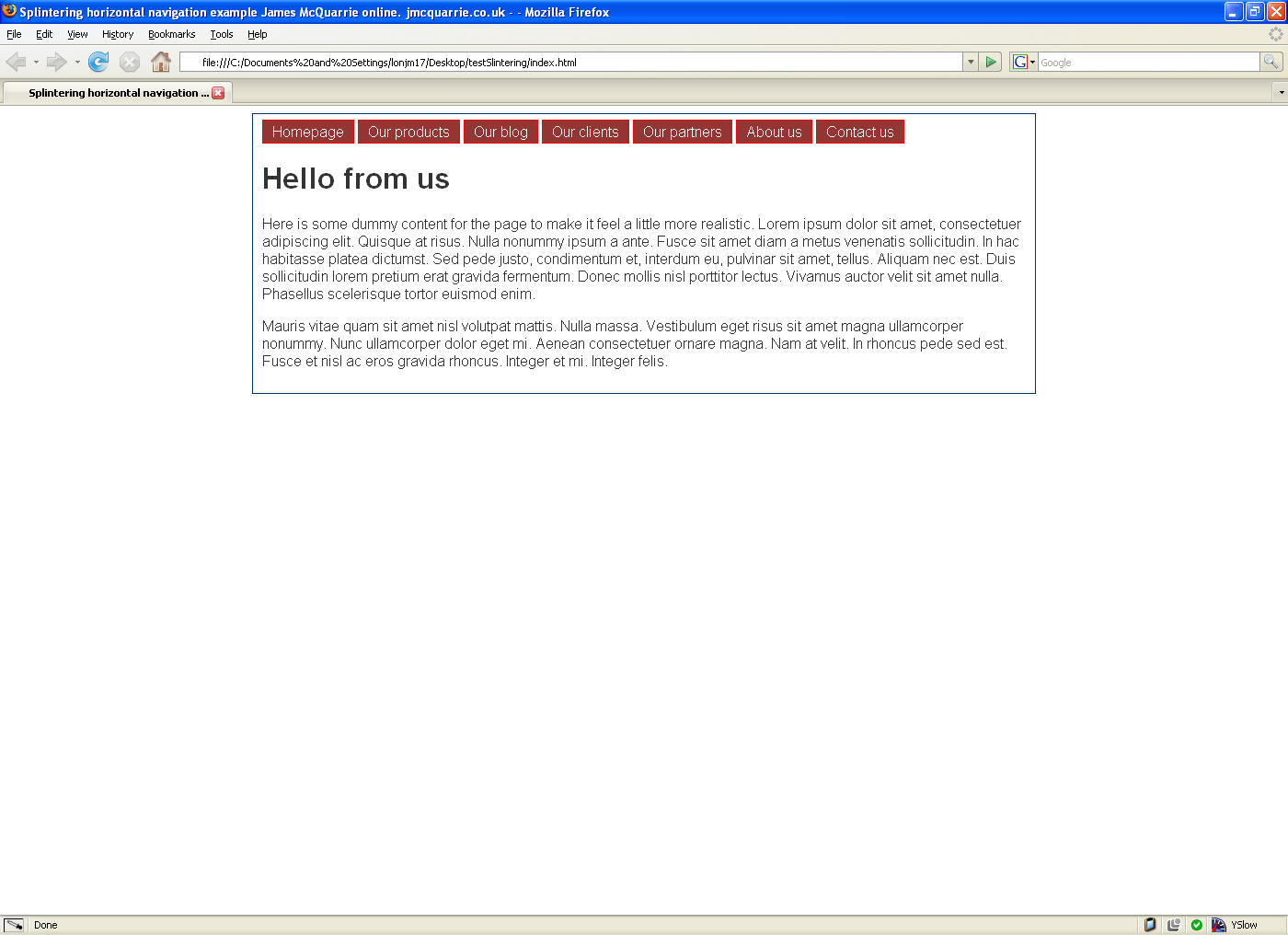
So far so good? Figure 1 – Example of horizontally aligned navigation menu shows how this common set up can look (click on the image to view full size).
 Figure 1 – An example of a horizontally aligned navigation menu.
This is a widely used design and can be achieved with minimal HTML and CSS with no problem, using CSS like this (based on Russ Weakley’s Rollover Horizontal list at Listamatic):
    #navContainer ul {
        list-style: none;
        margin: 0;
        padding: 0;
        }
    #navContainer li {
        display: inline;
        list-style-type: none;
        }
    #navContainer a {
        padding: 3px 10px;
        }
    #navContainer a:link, #navContainer a:visited {
        background-color: #933;
        border: 1px solid red;
        color: #fff;
        text-decoration: none;
        }
    #navContainer a:hover {
        background-color: #369;
        color: #fff;
        text-decoration: none;
    }
Splinter and overlap
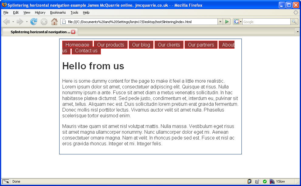
 Figure 2 – An example of a horizontally aligned navigation menu with splintering and overlapping.
However there is a common problem that affects most implementations of this type when used in a liquid layout: when the width of the menu’s container is too narrow, the last list items will wrap under the first. This wrapping results in two visual effects that we don’t want;
- If the wrapping list item has a space in its text (eg; “Contact Us”) it will potentially splinter and wrap only the “Us” bit, leaving the menu item reading Contact on one line and Us on the second.
- If the list item and its background color / image is too tall it will overlap the start of the menu making it appear as if the menu items are stacked, obscuring not only the text of the first items, but also the user’s ability to click on them.
Both of these issues can be seen in Figure 2 An example of a horizontally aligned navigation menu with splintering and overlapping and in this example page showing horizontal navigation (resize your window to see the effect).
CSS to the rescue
Luckily there are two simple CSS solutions to these problems.
- To solve the splintering problem add the rule: white-space: nowrap; to the list item rules (in my case #navContainer li). This will force the item to wrap in its entirety even if it contains spaces.
- To solve the overlap problem set the line-height value for the list items (again, in my case #navContainer li) to be higher than the text height (remembering the line-height values don’t need a unit, 1.2 is right, 1.2px is wrong).
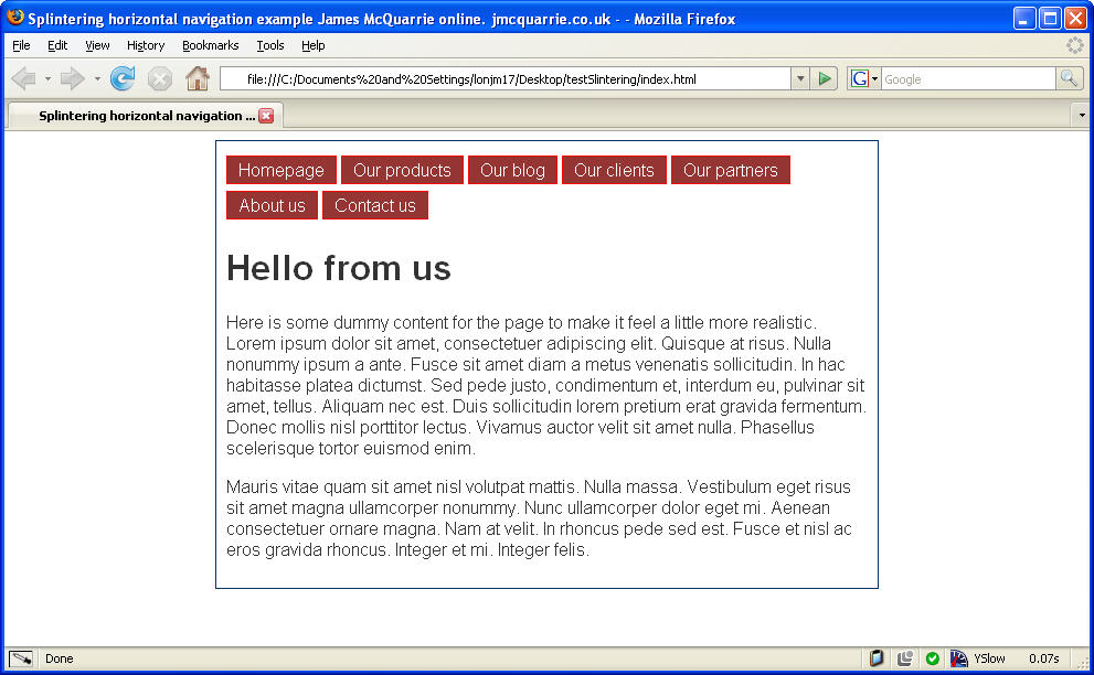
 Figure 3 – An example of a horizontally aligned navigation menu with splintering and overlapping fixed
The results of setting these two values can be seen in Figure 3 An example of a horizontally aligned navigation menu with splintering and overlapping fixed
See an example of the fixed horizontal navigation (again, resize your window to see the effect).